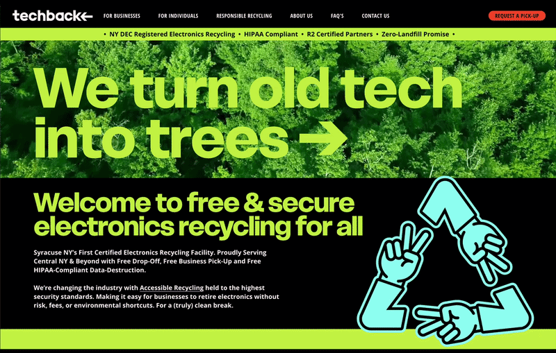
We didn’t want our website to be just a functional space. We built it to immediately set the tone for the entire recycling experience. Turning a typically transactional moment into something engaging, educational, and worth spending time with. Click below to check it out in action >
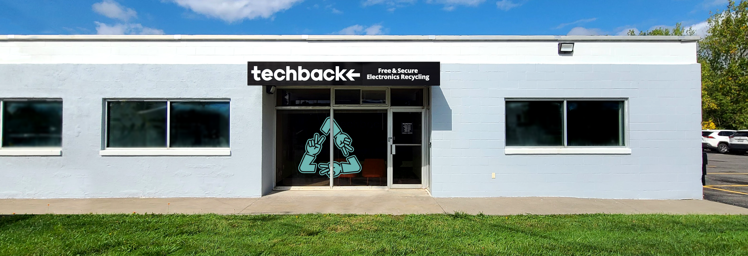
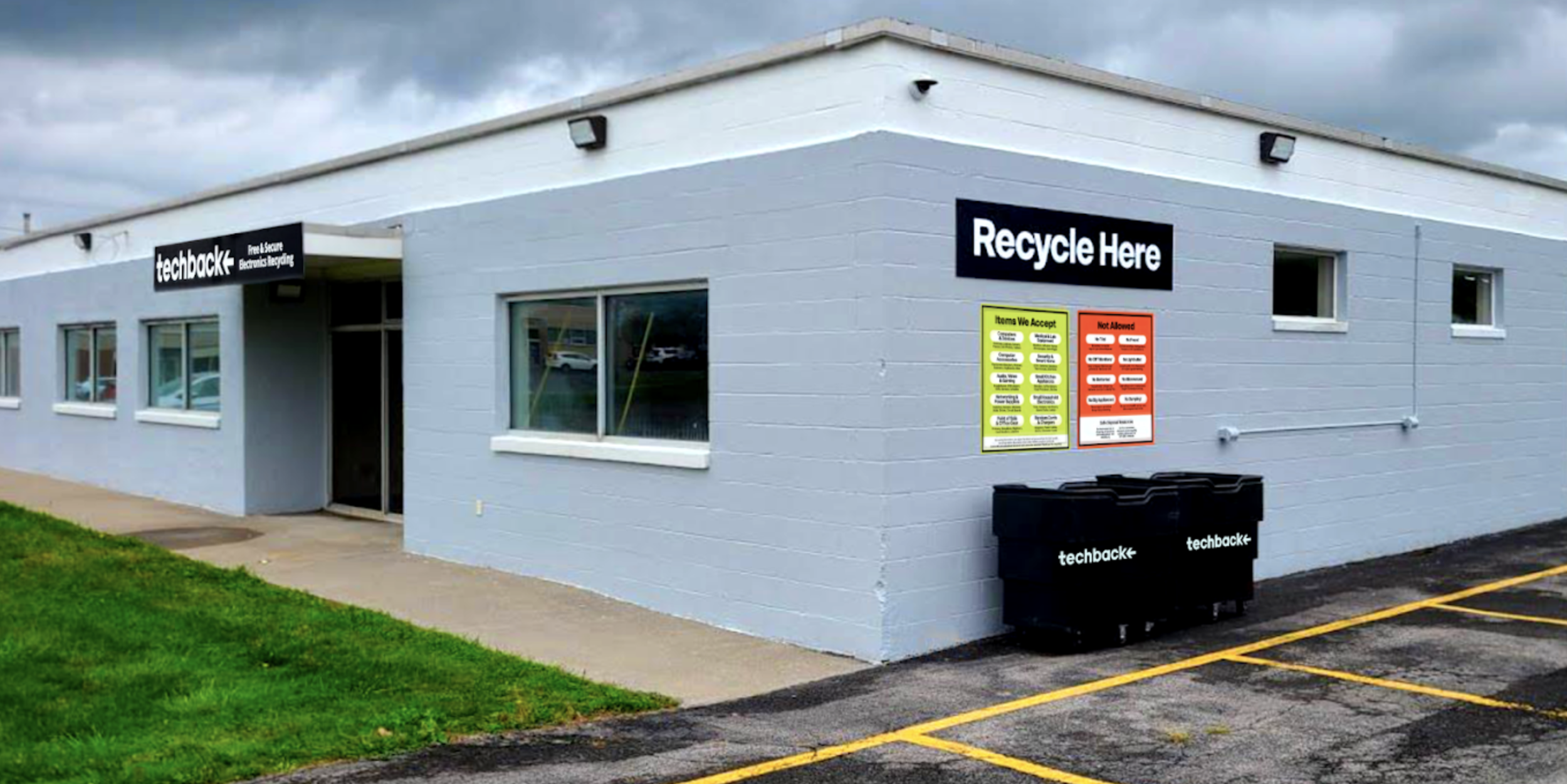
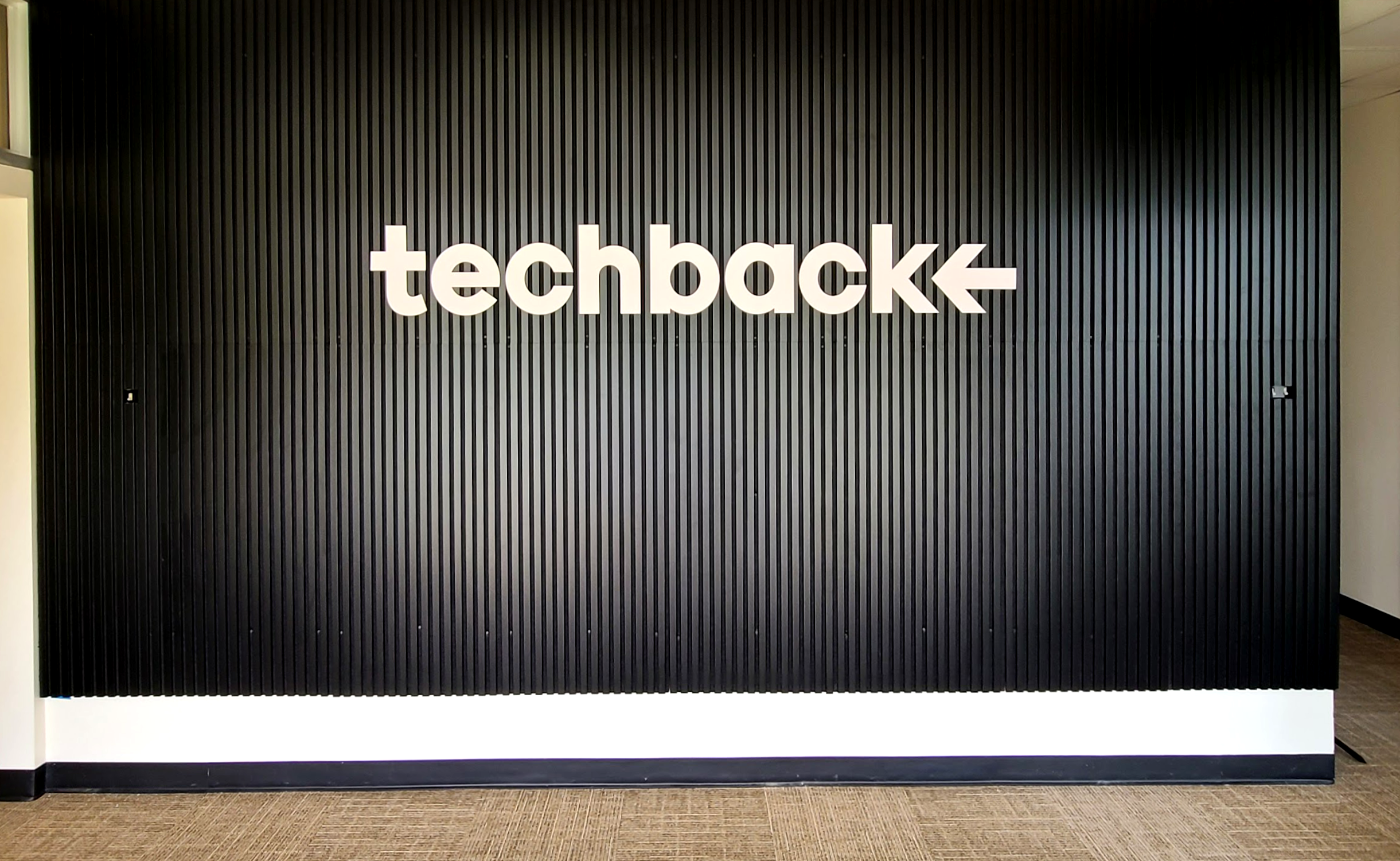
Our Central NY Headquarters are welcoming and easy to access, with a comfortable lobby and drop off area defined by bold signage in the black and white identity that anchors our brand.
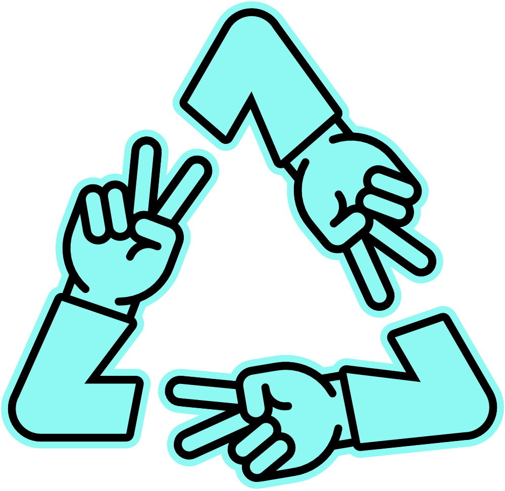
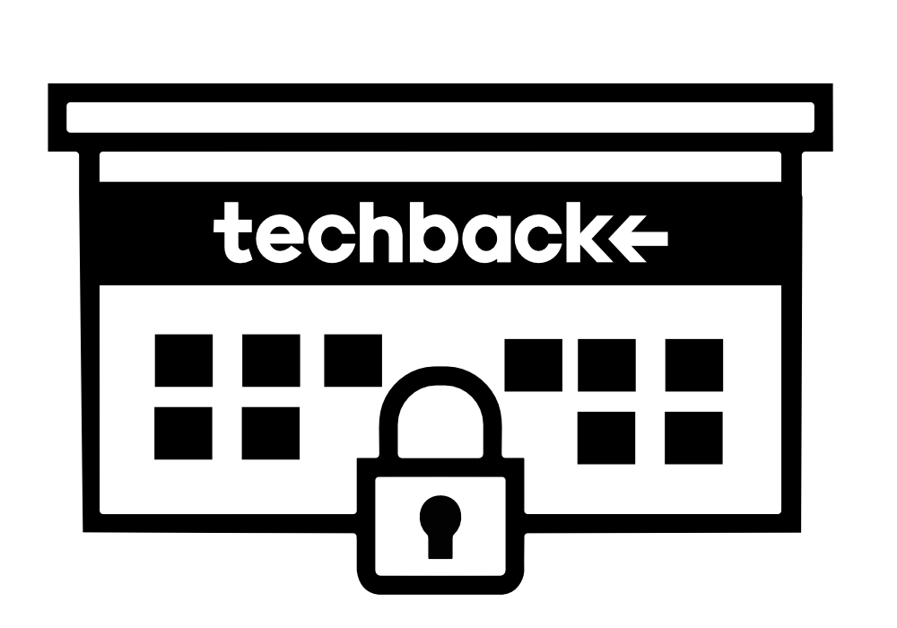
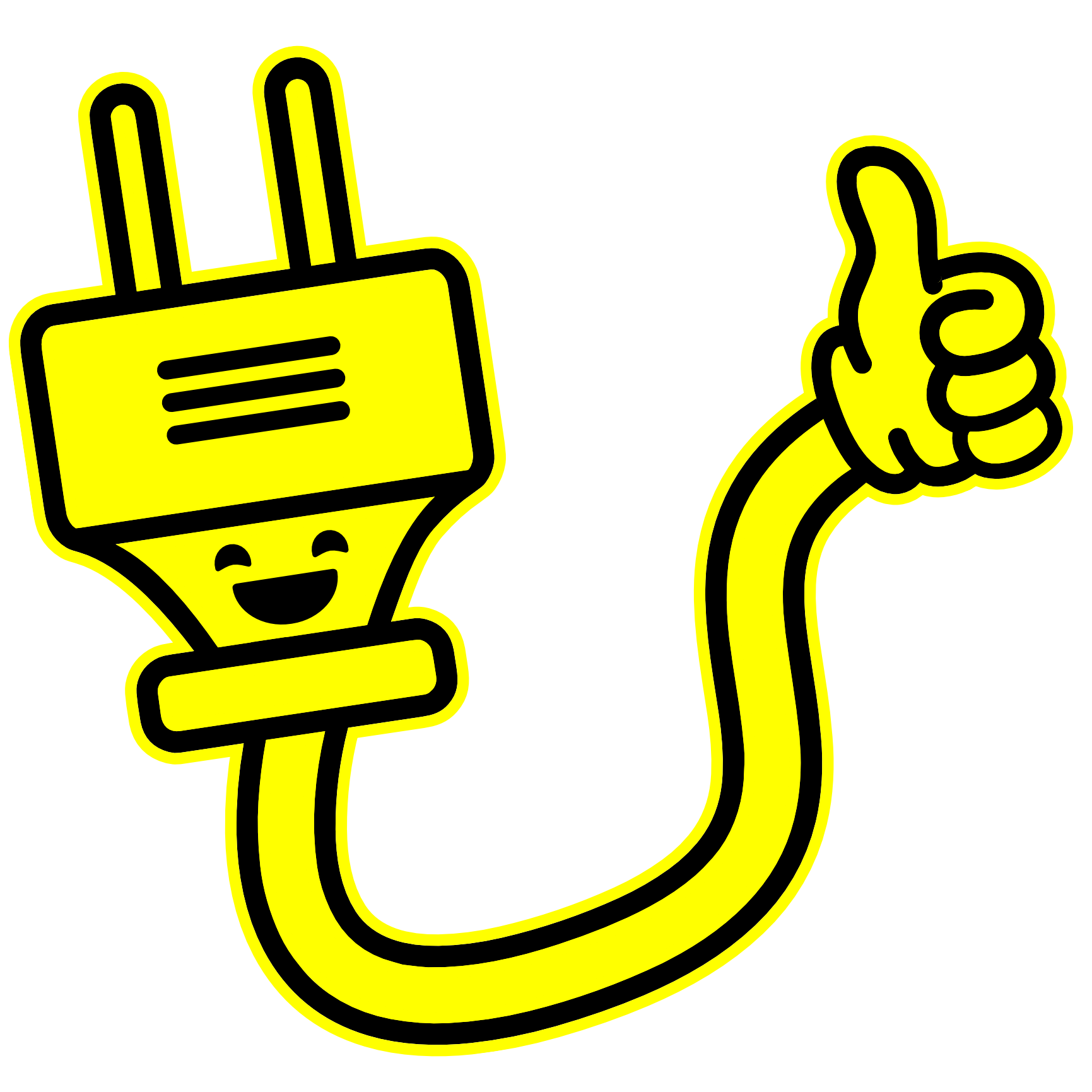
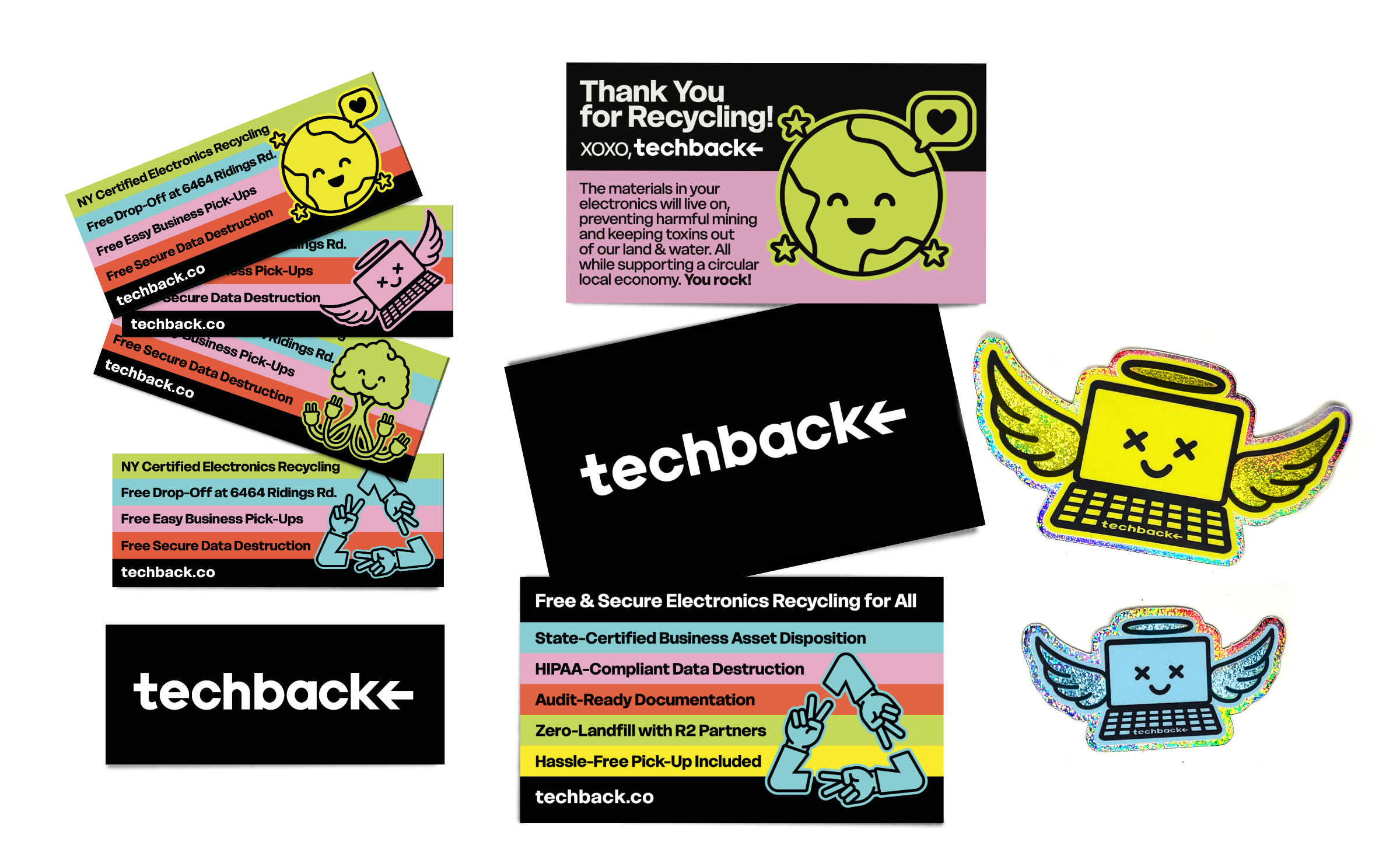
We built a visual language of bright, ownable icons that show up everywhere. Because when you’re trying to change how people feel about something as dry as recycling, words alone don’t cut it. These illustrations help to bring clarity, personality, and just enough joy to everything we do and say.


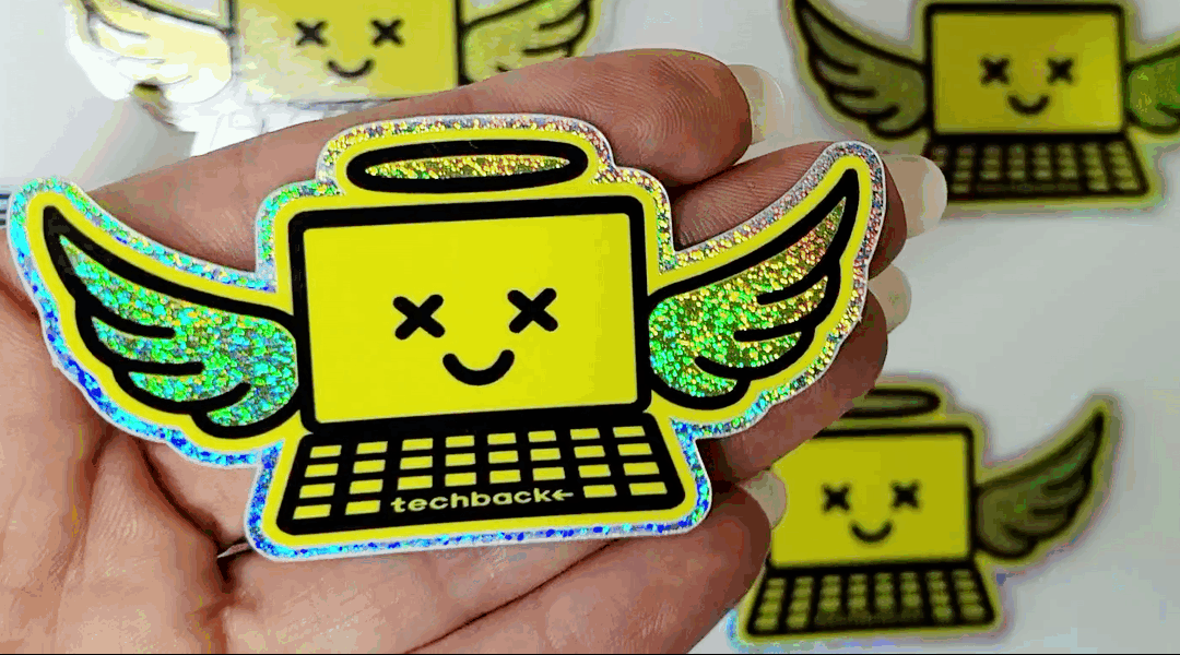
Our smallest touch points were designed to speak the loudest. From bold, information-forward cards to (glitter) stickers people actually want to stick to stuff, every piece is something to engage with, not ignore.
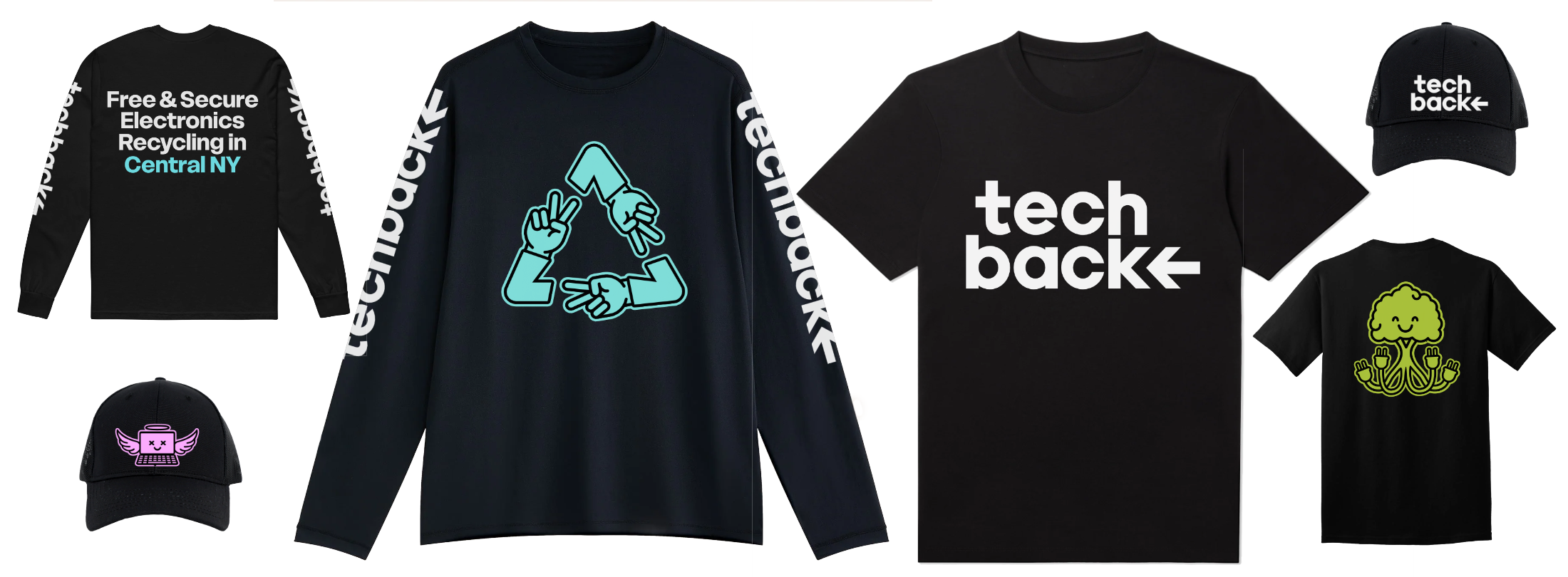
Employee uniforms and swag turn our team into an extension of the brand wherever they go.
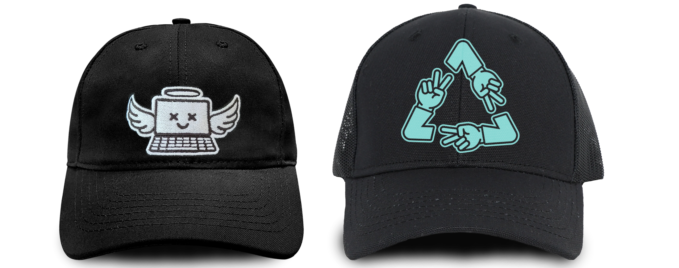
And clients always want a laptop hat. If you wouldn’t wear it it’s not good branding.